9.5) Plotting
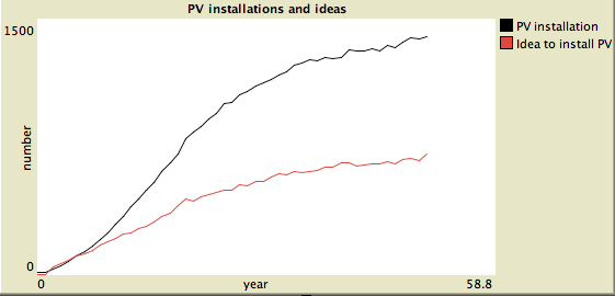
With this monitor we can now see how the fraction of PV increases over time up to somewhere between 25-30% after 50 years. This is great, but we like to display as well the development of variables over time. To do that we use a plot and display the total number of PV installations and the number of agents which had a think about installing PV in that year. Netlogo has a range of plotting features, read the programming guide on plotting to get an overview and get detailed information, for example to find out when plots are updated during a simulation run.
Go to the interface and select plot from the drop down menu, insert one, and name it PV installations and ideas. Set axis labels to year (x-axis) and number (y-axis), tick the box auto scale and show legend. For the first pen, name it PV installation or similar. We want to count turtles with PV, to do that simply insert plot count turtles with [PV] as a plot update command for the first pen. You can then add a pen (choose a colour you like), name it Idea to install PV, and use the same command as before just with PV-building-decision instead of PV. If you click ok you should get a plot similar to the one below after a model run.